Storm and Crime Data Report
- jaquasianicole
- Dec 2, 2023
- 9 min read
Updated: Jan 10, 2024
Date of Record: January 1, 2017 to December 1, 2019
Data Analysis Process Job Aid
Who should use this job aid?
This report is meant to be a supplemental aid for new hires conducting data analysis. This job aid will include simple instructions on when to apply certain data analysis methods, tools, and technology. The following steps can serve as a guide for data analysts within the ABC data consulting firm.
Introduction
The Miami police department is interested in finding the link between the increase in crimes and the presence of a storm. The goal of this report is to provide possible timeframes for these crimes in the future based on the weather. The information used to reach these insights is sourced from the city of Miami. A Storm and Crime Data Report (SCDR) will be created using historical data that dates from 10/1/2019 to 10/31/2019. The dataset being sourced contains 250 rows and nine columns.
Section 1.1: Type of Analysis
The data contains columns; ID, Date, CrimeEventID, CrimeActivity, StormEventID, StormActivity, ZoneCityID, Zone, and City. The variables most critical for this report are CrimeActivity, StormActivity, and ZoneCityID. The purpose of this analysis is to find any correlation between these variables in order to predict future instances of crime. In this case, StormActivity is the independent variable and CrimeActivity is the dependent variable.
Given the scenario, I would recommend using predictive analytics because it creates forecasts based on historical data. This is a great option considering the variables available to draw insights from; crime activity and storm activity. With more variables, it would be a great option to consider using correlation analysis to find the connection between both variables. Statistical tests, such as the Pearson correlation, determine whether there is a significant relationship between the two variables. Along with predictive analytics, diagnostic analysis is used to find a cause-and-effect relationship in a dataset by investigating the factors that contribute to certain outcomes. Correlation analysis is often used in this method. With Excel, the type of analysis will be different. This software supports pivot tables and charts, which are meant for analyzing and summarizing data. We can conduct data filtering and sorting to isolate specific sections of the dataset that are relevant to the goal. There is also the CORREL function that assesses the strength and direction of the relationship between two variables. There is also the option for time series forecasting through the FORECAST function.
Section 1.2: Define Parameters and Collect Data
The analysis in this report will involve the variables CrimeEventID to identify the type of crime and StormEventID to identify the nature of the storm. I will also include the ZoneCityID to categorize and group the findings for more accurate predictions. The criminal data variables relevant to this analysis are CrimeActivity. The options for this variable include; Violent Crime, Property Crime, and more.
We must create groupings or bins by storm activity to compare the frequency at which crime occurs. With this, we can see if there is a simple link between the two variables. To improve speculation we can create groupings by criminal activity to find how crime fluctuates relative to the nature of the storm. Of course, many factors relate to the reasons a crime is committed but there may be a link between the weather.
Section 1.3: Tool Selection
Above I mentioned using Pearson correlation to find a relationship between these variables. We can start by using the program JMP to begin cluster analysis. JMP is software for statistical analysis with a graphical user interface for visualizations from the SAS Institute. There are many tools and platforms available to reach results however, some options are better for visualizations. This choice provides statistical modeling tools like regression analysis, analysis of variance (ANOVA), and correlation analysis.
The program has a feature to find the optimal number of k-means clusters for the dataset. This type of correlational analysis creates a model to reveal patterns that could be overlooked. These results can guide the next step to further draw out insights and determine whether there is a statistical relationship between the variables included. Utilizing the JMP software we can also use geographic maps to visualize the location of the crime and the storm. For this scenario, I would recommend using a correlation matrix to find the relationship between two variables.
Unfortunately, JMP is not available so I will conduct the visualizations through Excel. This software is suitable for creating basic visualizations with flexibility, such as histograms, Box and whisker plots, as well as pie charts, among other options. Within Excel, I would recommend using bar charts, or even column charts to further differentiate the type of crime occurring.
Section 1.4: Validation
Filtering the data during data analysis allows for a better handle on the data, especially if the dataset is large in volume, it can be hard to comprehend. It is important to identify and include only the necessary variables because statistical models are sensitive to errors like under or overfitting. This report is concerned with finding a connection between crime and storm occurrences. The SQL query provided below shows the summary crime count for each storm behavior. The script has the results grouped by StormActivity to show how often a crime is committed during a specific type of storm. It may be worth investigating when the crime occurs relative to the storm through time series analysis. This would involve including the date variable as another grouping. The results make sense after consulting the overall dataset, it is worth noting that crimes unaccompanied by a storm (and vice versa) were excluded from the query.

The screenshots below include the pivot table produced from Excel where storm activity is the x-axis and the count of crime activity is the y-axis. This simple visualization is accompanied by a table that reflects what was produced by the SQL script. The bar graph shows that hail and strong wind rain have the most occurrences of crime activity.


The two screenshots below have the count of crime activity grouped by the nature of the crime. This is to provide more insight into what types of crimes are committed during each type of storm. The blank column is to describe the crime that happened without a storm being present.


Part 2
I. Introduction
2.1 Overview and Purpose
The Miami police department is interested in finding the link between the increase in certain crimes and the presence of a storm. To further this investigation, the department is examining the rising cost of crimes when storms occur. The purpose of this report is to provide detectives with information on the next possible string of crimes. The dataset being analyzed is from the city of Miami and occurred between January 1, 2017 and Dec 1, 2019. This is two complete years of crime data during storm events.
2.2 Purpose of Data Analysis
The goal of this report is to provide insight into when crimes occur and the cost that occurred after the crime. Data analysis is necessary for this project to reveal whether there is a significant relationship between the presence of a storm and the crime committed. This process involves extracting, transforming, and analyzing the relevant data to solve a problem. We are taking an exploratory approach to this project by identifying patterns in the data to uncover the cost of crimes in Miami-Dade County.
II. Data Preparation
2.3 Data Sources
To complete this analysis I will use the file titled ‘TimeseriesYearly.R’ files with the R studio software. The R studio interface offers statistical computing and the possibility to generate plots or graphics. Within this platform we are accessing a file titled ‘crimnostormQ.csv’, which entails two variables; the dates and the amount lost. We are also accessing ‘crimestormQ.csv’ which is formatted in the same way with two variables. These two files will be compared to find the difference in loss during a storm and without the presence of a storm.
2.4 Filter Through Unnecessary Data
Filtering unnecessary data is done to minimize the processing time required when analyzing a large dataset. This practice is also done to help models better identify trends in a large dataset with many outliers. For this analysis, we will be filtering the data by date to ensure we are extracting insights from 2017 to 2019.
2.5 Define Parameters
A parameter in data analysis is a value that describes the population. Statistical parameters describe the behavior of the data. A great example of a statistical parameter is the central tendency, which can be found by using the mean, median, and mode (Kalla, 2011).

2.6 Identify Measurement Priorities
The priority in this report is identifying the difference in crime cost between a storm occurring and no storm. This will work to accomplish the overall goal and fulfill the purpose identified above. The value being measured here is the cost incurred in terms of thousand (K$).
2.7 Ensure Collected Data Fits Needs
To ensure the data selected will appropriately answer the problem, it is important to properly identify the purpose and the parameters. With this established, the next step is considering the relevance of the dataset. This portion is mostly done when sorting out what data is unnecessary and should be filtered. To discern whether there is enough data we can turn to the Central Limit Theorem (CLT) stating a sample size greater than 30 is sufficient (Ganti, 2023).
III. Data Analysis
2.8 Identify Scripts Used
The first section of the script is to install the necessary packages to produce insightful visualizations. The package “tframe” provides functions for time series analysis with time windowing and the ability to create plots. While the “tfplot” package is used in conjunction with the “tframe” package for better manipulation of the data. This package also helps with plotting time series data.
install.packages("tframe");
install.packages("tfplot");
library("tframe");
library("tfplot");
This next portion is done to read the two CSV files; ”crimstormQ” and “crimenostormQ”, into R Studio for plotting later. The data within these files are also printed for viewing.
crimestormdataQ <- read.csv("crimeStormQ.csv")
print(crimestormdataQ)

crimenostormdataQ <- read.csv("crimenostormQ.csv")
print(crimenostormdataQ)
Next, we are using the function “cumsum” to plot the cumulative sum of the victim loss amount by storm presence. The function”ts()” is also used to specify time series analysis and create the time series object; “z” and “x”.
z<-ts(cumsum(crimestormdataQ$Loss)/1000,start=c(2017,1), frequency=12)
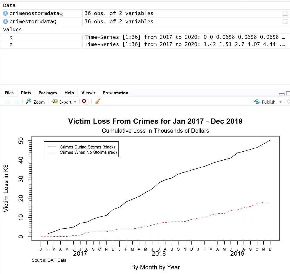
x<-ts(cumsum(crimenostormdataQ$Loss)/1000,start=c(2017,1), frequency=12)Now we are plotting the time series objects we created before. The Y-axis is for “victim loss in K$” and the X-axis measures time “by month” and “by year”. The following line in the script sets the title of the graphic to “Victim Loss From Crimes for Jan 2017 - Dec 2019” with a subtitle of “Cumulative Loss in Thousands of Dollars”.
tfplot(z,x,
       ylab="Victim Loss in K$",
       xlab="By Month by Year",
       title="Victim Loss From Crimes for Jan 2017 - Dec 2019",
       subtitle = "Cumulative Loss in Thousands of Dollars",
       legend=c("Crimes During Storms (black)", "Crimes When No Storms (red)"),
       source="Source: DAT Data")
2.9 Run Scripts & Validate Output
Data validation is the practice of ensuring the results are accurate meaning it reflects the population. I ran each script one by one to ensure the packages were loaded correctly and other functions were processed. Validating the output of the scripts involves understanding the nature of the data and discerning whether the output aligns. Considering there are no unusual spikes in the line graph I feel comfortable believing the results. The results also align with the expected outcome, where crimes during a storm lead to higher loss.
IV. Drawing Conclusions
2.10 Present Results to Stakeholders
The screenshot provided below details the victim's loss from crimes. The black line shows the crimes during storms and the red line represents crimes when no storms have happened. We can see that the cumulative loss from crimes during a storm is higher than when no storm is present. By the end of the year 2019, the cumulative amount lost is nearly $20k for crimes when there is no storm. While the cumulative loss is at $50k for crimes committed during a storm. It is important to note that we are interested in the rate of increase, the graph will not decline at any point because the values are cumulated. This plot aligns with the mean identified above where the mean for crimes committed without the presence of a storm is $503.37. The mean for loss is significantly higher for crimes committed during a storm at $1399.38.
2.11 Determine if the Problem Was Addressed
The analysis is aimed at examining the rising cost of crimes when storms are occurring compared to when they are not. The two datasets analyzed proved sufficient when comparing the victim loss from crimes in different weather. The results can be used to support decisions regarding police department resources for preventing future crimes. The conclusions reached in this report are only limited by the capacity of the dataset.
2.12 Report Potential New Findings
After the exploratory data analysis process there is often room for expanding research. To extract more information from the dataset it would involve including more elements and variables to analyze. By separating the specific nature of the crime or the type of the storm occurring it can create a bigger and more nuanced picture. With these possibilities, we can create a new hypothesis and question to answer to begin the data analysis process again. After analysis, a model could be created to predict future losses from crime during seasons of heavy storms. For example, by adding the element of socioeconomic status, data analysis can be used to find a correlation between low-income or disaster-prone regions and the occurrence of crime during a storm.
Citations
Ganti, A. (2023). Central Limit Theorem (CLT): definition and key characteristics. Investopedia. https://www.investopedia.com/terms/c/central_limit_theorem.asp
Kalla, S. (May 6, 2011). Parameters and statistics. https://explorable.com/parameters-and-statistics
Comments